Project 1: Flier
Description:
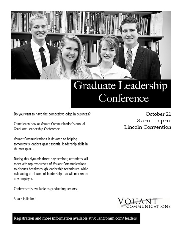
A Black & White flier to promote a conference for recent graduates that will help them develop leadership skills that are essential for the fields of business.
Process:
Before starting my project, I did several sketches to plan out my ideas for the flier, and then chose which one I thought would compliment the best theme for my message I wanted to portray. With my best sketch, I created the layout in Adobe InDesign. I used black boxes to provide contrast in my white space, as well as different typography that would be professional as well as appealing to the eye. I used white font on a black text box for my title in order to make it bold and more eye catching. I made sure to align my text throughout to create a respectful rhythm. I used the image, logo, and content for this flier that was provided for me.
Message:
I am trying to reach recent graduates, who are interested in the next step in their lives, and want to develop leadership skills that will be a qualified aspect in the fields of business.
Audience:
Recent graduates who are 22-30 years of age and want to develop principles as a leader in business.
Top thing learned:
I learned the importance of having white space, and to not overwhelm the flier with unnecessary designs.
Title Font Name & Category:
Big Caslon – Oldstyle
Copy Font Name & Category:
Abadi MT Condensed Light – San Serif
Links to all images you used in this project:


January 26, 2014 at 12:41 am
After viewing your flyer, I noticed your picture is the focal point of your flyer and I love that! Having your picture that big on the top of the flyer is a great attention grabber. I like the emphasis you gave your title and some of your other important information by putting it on a black background. Great contrast! You included white space which is great but I think it’s almost too much, something needs to pull the eye back to the page or it wants to wonder off the page to the right. Great Job!
Here is a link to a flyer that has a great use of white space.
http://evenaylor.wordpress.com/
Here is the link to my blog.
bethanytaylorgraphics.wordpress.com
Thanks!